Sign up for our free daily newsletter
Get the latest news and some fun stuff
in your inbox every day
Get the latest news and some fun stuff
in your inbox every day
According to Yahoo finance, Apple is back on top of the charts in terms of market capitalisation. It is often hard to tell because the companies are in the middle of big share buyback programs. The throne is currently changing hands between Apple and Microsoft.
Last week I came across this great article titled Apple Explained in charts. Sometimes a chart can say a thousand words.
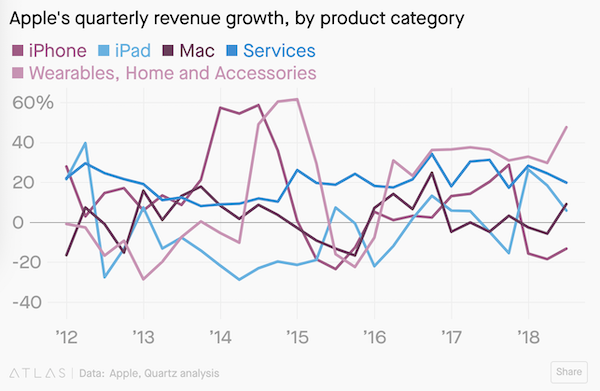
The trend of many of the graphs does show a slow down in growth. That is to be expected. When you get that big it makes it very hard to maintain such solid growth.
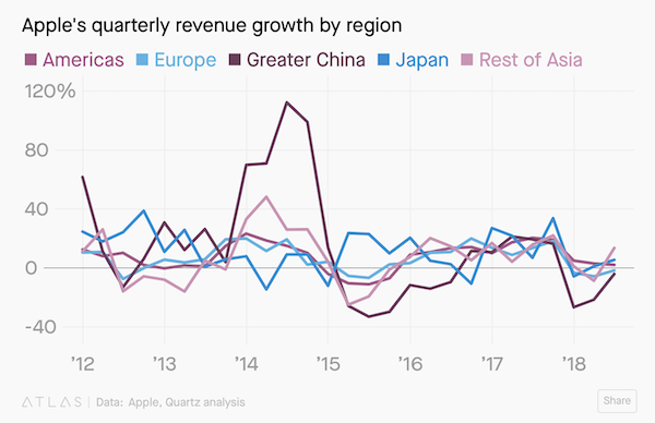
This chart in particular was very interesting. The relationship with the Chinese consumer has been volatile.
I also like this graph. It shows the recent downward trend of the influence of the iPhone.
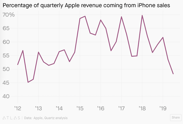
Almost all its other businesses are growing nicely other than the iPhone.
This is a fabulous business, every US portfolio should have some Apple shares.